Google Workspace Marketplace

Charts, Graphs & Visualizations by ChartExpo
Select a chart, select your data, and then press the “Create Chart” button. Insightful charts without the hard work!
Listing updated:April 1, 2026
Works with:
714K+


Overview
Simply Powerful:
ChartExpo is a Google Sheets™ charts tool that makes it simple to gain insights from your boring spreadsheets. Simple is not basic. Simple is powerful. When you solve a complex data problems with a simple chart or graph, the result is monumental. It is the “Aha!’ moment that seems so simple, yet produces such profound change. You can create network diagrams, flowcharts, comparison charts, sentiment graphs, survey graphs, feedback charts, customer support charts, customer experience charts, PPC (Pay per click) charts using ChartExpo chart maker. ChartExpo seamlessly integrates with Google Sheets™ , allowing you to generate and use the chart images in Google™ presentation software aka Google Slides™ effortlessly.
Overwhelmed With Data, Starving For Insight:
Data is useless without insights. Your problem is not that you lack data. Your problem is that there is not enough time and resources to analyze your data for advanced analytics, which could be simplified and visually represented through Google Sheets™ charts. Spreadsheets are helpful for collecting and organizing information, but fail to bridge the gap between your data and the insights you seek. You need to chart the numbers and know flow of your data (e.g., finance charts) using good charts.
Accessible Insights:
Manually analyzing data with data visualization tools requires coding and endless clicking through spreadsheets. ChartExpo, Google Sheets™ graph maker is effortless. You can create visualizations in three clicks. Insights that have always felt out of reach are now right at your fingertips with this cool Google™ charts library.
Learn The Language Of Data Using Google Sheets™ Charts:
Your data holds insights that are hidden behind the walls of spreadsheet numbers. Visualizations translate the language of numbers into charts that spark innovation. Visualizations enable fast comprehension and data interpretation because your eyes are better at absorbing visual information. Visualizing your data with Google Sheets™ charts on web saves you valuable time. Business Intelligence (BI) uses historical data for future prediction and views on Business Data Apps.
The complex data transformation into visual story telling or indicators like material flows in production system, financial dashboards, graphic reports, responsive charts and analytical graphs are frequently used to increase business growth.
Make Competitive Decisions with Advance Google Sheets™ Charts:
Import competitor analysis data and discover actionable insights at a glance and accelerate your decision making and problem solving with visualizations. Become your competitors’ biggest threat with predictive analytics faster, while they waste time and energy with manual analysis.
Find The Unexpected:
Charting libraries like Google Sheets™ charts help you cut through noise of chaotic data sets, you uncover new trends, relationships and patterns. It has ready-to-use machine learning and (NLP) natural language processing (sentiment) charts to provide pertinent insights like any other self-service analytics platforms.
Data visualization toolkit can help data engineers, data scientists, BI specialists, visualization engineers, business analytics, statisticians, financial analysts, journalists, publishers and researchers to make critical business decisions for individuals and corporations.
Best Google Sheets™ charts for industries: energy sector, financial services, retailers, pharmaceutical, fleet management, warehouse management, inventory management, process management, project management, food supply chain, transportation & logistics, healthcare, pharmaceutical, service providers, travel agencies, recruiting agencies, education, technology, banking, insurance, telecom, ecommerce, supply chain management, marketing, material flow analysis and management, plant planning, process engineering, startups, small businesses, social graphics, business graphics, Facebook banners, economic trends, public spending, business projections, engaging infographics and all other enterprise organizations and businesses.
Share and Publish Google Sheets™ Charts:
• Download the dataviz as PNG, SVG, PDF and JPG
• Embed chart templates and reporting templates in blogs or websites
• Post on social media
• Create presentations, dashboards & Reports from charts and graphs
Custom Google Sheets™ Charts with Ease:
ChartExpo chart designer for Google Sheets™ provides a rich properties to customize charts, customize colors, fonts, styles, backgrounds etc. Save time preparing customizable visualizations and interactive plots for your presentations, insert them directly into your Google Slides™. Simply better than d3 charts. Visual report development making easy for business users. Visualize disparities in Medicare. Surely, your graphs creator and interactive content creation tool. Whether you are creating cumulative diagram, customer demographics report, data discovery add-on is designed to make process simple.
Improve your business reports, data presentations, visual graphics, pictographs, data widgets and dashboards using modern charts and present data in a visual way. An alternate for business graphic design software.
Different types of data charts, statistical graphs, and smart visualizations for quantitative data analysis, qualitative data analysis and graphing data.
Get data from survey softwares (e.g. Google Forms™ for survey, SurveyMonkey, Typeform, Qualtrics etc.) and get insights quickly.
Improve financial portfolio and decision KPIs (e.g., ROI, NPV, revenues, expenses, forecast reporting, actual vs planned etc.)
Business Analysts - looking for a quick and easy rich charts application like PowerBI and/or Tableau, you'll love this product!
Enhanced Data Visualization Capabilities:
ChartExpo’s Google Sheets™ add-on offers a robust suite of features designed to transform your data into actionable insights, no more misleading charts. From cross-sectional and longitudinal surveys to complex revenue cycle analytics, ChartExpo, enabling users to visualize data with unmatched clarity. Create detailed SWOT analyses, brand loyalty charts, and market basket analyses to guide strategic decisions.
Advanced Survey and Reporting Tools:
Optimize your survey efforts with embedded support for Likert scale questionnaires, open-ended questionnaire, double barreled questions, psychographic segmentation, linear scale questions and employee engagement surveys. Tool for detecting response bias, social desirability bias, and acquiescence bias, ensuring your surveys yield reliable results. Enhance your reporting with ad hoc reporting, scale slider, semantic differential scale and scenario analysis.
Customizable Visualizations for Any Need:
Whether performing sensitivity analysis, creating conversion metrics Chart, visualizing customer effort score and costs breakdown, ChartExpo offers intuitive interface for creating bespoke visualizations. Ideal for data analysts, and marketing teams looking to make data-driven decisions (data democratization) quickly.
Tools for Modern Data Challenges:
Navigate modern data challenges with ChartExpo’s comprehensive toolset. From understanding visual perception in data to utilizing process improvement charts. You can also create chart for CRM analytics, SEO analytics, YouTube analytics and track social media engagement effectively.
ChartExpo for Google Sheets™ has a number of advance charts types along with spectrum charts and supply demand charts, best chart or graph from charts gallery for marketing reports, agile dashboards, and data analysis:
1. Sankey Diagram
2. Bar Charts
3. Line Graphs (Run Chart)
4. Pie and Donut Charts (Opportunity Charts, Ratio chart)
5. Slope Chart (Slope graphs, Bump Chart)
6. Radar Chart
7. Pareto Chart
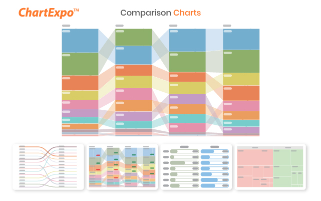
8. Comparison Charts
9. Scatter Plot (XY Graph, Correlation Scatter Plot)
10. Stacked Bar Chart
11. Stacked Column Chart
12. Area Charts
13. Treemap Chart
14. Gauge Chart (Needle Chart, Speedometer chart)
15. Sparkline Chart
16. Sunburst Chart
17. Star Rating Chart
18. Likert Scale Chart (5 Point Likert Scale Chart)
19. CSAT Score Chart (NPS Chart)
20. Map Charts (Geo Charts)
21. Word Cloud and Tag Cloud
22. Chord Diagram
23. Dot Plot
24. Radial Chart (Circular Bar Chart)
25. Tree Diagram
26. Co-Occurance Chart
27. Heatmap (Fulfill dual purpose like Waffle Chart)
28. Funnel Chart (Conversion Funnel)
29. Progress Chart
30. CSAT Score Survey Chart (NPS Detail Chart)
31. Customer Satisfaction Chart
32. Sentiment Trend Chart
33. Double Axis Line and Bar Chart (Combo Chart, Combination Chart)
34. Multi axis/Vertical Axis Line Chart
35. Multi Series Line Chart (Burn down Chart)
36. Matrix Chart (Grid Chart)
37. Quality Score Chart (Ranking Chart)
38. Performance Bar Chart
39. Crosstab Chart
40. Customer Journey Flow (Sankey Diagram)
41. Energy Flow Diagram (Sankey Diagram)
42. Energy Flow Charts (Sankey Diagram)
43. Solar Energy Diagram (Sankey Diagram)
44. Wind Energy Diagram (Sankey Diagram)
45. Nuclear Energy Diagram (Sankey Diagram)
46. Customer Journey Map (Sankey Diagram)
47. Context Diagram (Force Directed Graph)
48. Text Relationship Chart
49. Credit Score Chart
50. Sequence Chart
51. Spider chart
52. Polar chart
53. Components Trend Chart (Control Chart)
54. Grouped Bar Chart (Clustered Bar Chart)
55. Grouped Column Chart (Velocity Chart, Clustered Column Chart)
56. Box and Whisker Plot (Box Plot)
57. Tornado Chart (Side by side bar chart)
58. Overlapping Bar chart
59. Control Chart
60. Dot Chart (ORA, Visualization for Gene Set Enrichment Analysis)
61. Ordered Squares Chart (Proportion Chart)
62. Waterfall Chart (Bridge Chart, Cascade Chart, Stacked Waterfall
Chart)
63. Double Bar Graph (Pyramid Chart, Butterfly Chart, Demographic
Charts)
64. Circular Org Chart
65. Stacked Gauge Chart
66. Multi Gauge Chart
67. Histogram
68. Multi Axis Clustered Stacked Chart
69. Multi Axis Spider Chart
70. Progress Circle Chart
71. Expansion Funnel Chart
72. Clustered Stacked Bar Chart
73. Horizontal Waterfall Chart
74. Mosaic Plot (Mekko Chart)
ChartExpo, Google Sheets™ charting tool is free for first 7 days. After this no-risk trial, service costs $10 per user per month. You can sign up from Google Sheets™ add-on and use it for creating your daily reports and monthly reports.
Simplify your spreadsheet with ChartExpo Google Sheets™ live charts and data visualizations. Visualize your data with useful charts in few clicks and create management reports quickly.
If you are working on data science projects and looking for insightful visualizations and colorful charts, ChartExpo can help you with awesome charts.
Collection of visualizations best for exploratory data analysis. Univariate analysis with box plot (IQR), displays statistic measures (minimum, quartiles, percentiles, mean, median, maximum, standard deviation and outliers). Scatter plot is there for multivariate analysis and best chart for regression analysis, display linear regression model with degree one and more.
Quality assurance chart is one of quality management tools for process improvements (six sigma) helps in root cause analysis and reduce errors.
You can import PostgreSQL (Postgres) data into Google Sheets™ and make advance visualization images. ChartExpo is code less environment (no code / zero code) for data storytelling to make charts online, you can effectively use even if you don’t have hands-on experience with Python, Matplotlib or Pandas libraries.
Right place to get popular charts, if you are looking for interactive charts for Crypto, Investment or Sales (actual vs target) Charting.
Import your data from Google Forms™ to sheets and analyze with advanced survey charts.
Best suited charts for following industries:
Hospital & health care, government relations, government administration, restaurants, consumer goods, religious institutions, human resources, leisure travel & tourism, marketing & advertising, wellness & fitness, farming, management consulting, business supplies & equipment, financial services, water company, electric company, public utilities, public safety, sports, food production, education management, market research, retail, airlines/aviation, biotechnology, publishing, law enforcement, medical devices, environmental services, staffing & recruiting, e-learning, international trade & development, higher education, entertainment, nonprofit organization management, libraries and many more.
Picture a Thousand Numbers.
See the Big Picture.
For help please visit: https://www.chartexpo.com
Tags:
Custom Visualizations, data presentation, dynamic graphs, multi-colored bar graphs, analyzing and interpreting data, annual financial reports, procurement spend analysis, comparing two sets of data, net promoter score, trendlines, SaaS, dashboards, customer service KPIs, ranking data, competitive analysis, prescriptive analytics, 3-axis graphs, funds flow diagrams, renewable energy charts, trend analysis, hierarchical data, multi-dimensional graphs, financial statement analysis, variance charts, year-over-year comparisons, sales pipelines, budget template tracking, workforce analytics, mixed methods research, data consolidation, multiple regressions, time-series graphs, residual plots, density plots, exponential growth charts, data mining, chart examples, audit macroeconomic datasets, analyze balance sheet, expense report template, income statement template, weekly reports, data mapper, data flow mapping, infographic-style presentations, sample survey result, food survey, applied behavior analysis, customer behavior analysis, data classification, break even analysis, task analysis, SOAR analysis, stakeholders analysis, feasibility study analysis, bivariate analysis, human resource KPIs, people analytics, website KPIs, discounted cash flow analysis, transaction analysis, CRM analysis, sell-through rate analysis, augmented analytics, Data collection, data preparation, raw data¸ structured vs unstructured data, data strategy, data Catalog, data fabric, data processing, transpose data, extract data from a pdf, data validation, Sales dashboards, Data modeling, financial analysis, Executive dashboards, KPI Graphs, Graph design, animated charts, animated graphs, Data dashboard, Competitors Price Analysis, Marketing Agency Client Dashboards, Profit and Loss Statements, Healthcare Dashboards, Customer Relationship Management Dashboard, financial modeling, Inventory turnover tracking, Retail Industry KPIs, Supplier Scorecards, 360 feedback, cost performance, project status reports, EBITDA, CapEx, Payback period, Contribution margin, hedge funds, venture capital, growth equity, Monthly Budgets, Task Tracking, Cost analysis, Store Performance Dashboards, Return on Investment (ROI), Price to Earning Ratio, data cleansing, data profiling, portfolio diversification, Recruitment Dashboard, financial statements, data lake, Excel plug-in metrics and KPIs, nominal vs ordinal data, central tendency bias, psychographic segmentation, incident reports, advanced data analysis, AI in data analytics, anomaly detection, reduce analysis paralysis, market basket analysis, churn rate analysis, path analysis, comparative analysis, processing large datasets, information overload, insights hidden in your data, pivot reporting, cohort analysis, customer segmentation, customer lifetime value, customer retention, customer lifecycle value
Google Sheets™, Google Slides™, and Google Forms™ are trademarks of Google LLCAdditional information
sell
PricingFree of charge trial
code
Developer
Non-trader
email
Support
lock
Privacy policy
description
Terms of service
flag
ReportFlag as inappropriate


Search
Clear search
Close search
Google apps
Main menu