5 Simple Design Tips for Better Add-ons
Ben Greve
Developer Support Specialist, Google Apps Script
Try Google Workspace at No Cost
Get a business email, all the storage you need, video conferencing, and more.
SIGN UPSo you’ve started to build an add-on. Congrats! You identified a problem, figured out a solution, and wrote some code to accomplish it like a pro. Now it’s time to focus on design, to make sure your audience understands what your add-on does and how to use it.
In this post, I will outline five simple design tips to help make your add-on a pleasure to use. Don’t worry if you’re not an artist – these are basic concepts that anyone can apply.
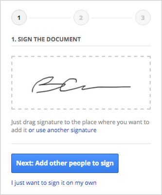

Create a clear workflow for the user to follow. PandaDoc by PandaDoc
1. Guide the User
Crafting a guided workflow takes the guesswork (and stress) out of using an add-on. Your user should never wonder, ‘What am I supposed to do next?’ Actions, forms, text, and buttons should be designed to create a natural flow guiding the user from one step to the next.This can be accomplished in a number of ways. Try presenting actions in a natural order: from left to right and from top to bottom (assuming LtR language; adjust as needed). You can indicate which button is the primary action by styling it using the blue .action
class. You can guide the user’s behavior by limiting the actions available (sometimes referred to as ‘forcing function’). For example, actions/options with dependencies can be disabled or hidden until they should be used. Another option is to spread a workflow across several pages and require the user to complete a given page before they can proceed to the next.


Communicate each step so the user is never lost. Remove Duplicates by AbleBits
2. Communicate Effectively
Complex add-ons require effective communication. Simple add-ons do, too. Effective communication is necessary for your audience to understand what your add-on does and how they should use it.Use accessible language that anyone can understand. Don’t use complex wording if more easily digestible terminology is available. Unless your target audience has been demanding a feature to “asynchronously call an RPC with dependent proto messages,” you should avoid using unnecessarily technical or jargony language.
Present information when and where it’s needed. Instructions should be displayed in the context which they will be used. Actions should be clearly labeled so that users will know exactly what they do. Provide enough information so the user understands what they are doing, why they are doing it, and where they are going.
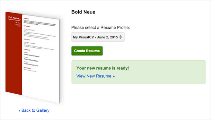

Inform the user of the results of their actions. VisualCV Resume Builder by VisualCV
3. Provide Feedback
Have you ever used an app where you click on a button and nothing happens? You sit there wondering: Did it work? Did it not work? Did anything happen at all? When building your add-on, don’t do this to your users. Make sure that all actions have clear and immediate feedback, so no one is never left wondering, “What just happened?”.With this in mind, there is still room for graceful design. Feedback can be subtle - it doesn’t need to shout, ‘ACTION 1 COMPLETED’! Leverage nuanced changes, such as displaying a quick message in a toast or moving to the next step in the workflow.
What happens if an action takes a long time to complete? Someone clicks a button and waits… and waits… and waits. A good UI will account for this scenario, too. Try using a loading graphic (i.e. a spinner or a progress bar) and for longer loading times consider including a button to cancel.
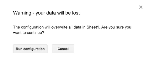

Protect the user and include safety measures.
4. Keep The User Safe
People make mistakes. It’s sad but true, and unlikely to change any time soon. Keep your users safe from themselves and design actions to have minimal risk.The ideal solution is to remove the risk entirely. Inserting a bunch of data into a spreadsheet? Consider creating a new sheet and insert the data there. When appropriate, configure actions to add rather than replace, minimizing potential damage to existing content.
There will be situations where avoiding risk entirely won’t be possible. In these cases, do the best you can to explicitly communicate the action’s effect so your user can make a well-informed decision. A preview or a warning of the impending changes will help ensure that the user is aware of what’s coming. And of course, provide a method to ‘undo’ when possible.
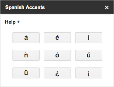

Design around core functionality. Easy Accents by Daniel Baker
5. Keep It Simple
Each UI element in your add-on should serve a purpose; consider removing anything that doesn’t. For the best design, keep it focused on functionality and trim any excess.Using a large range of styling can actually undermine the power of the design. When a website is covered with different colors, styles, and fonts, it makes it difficult for any styling to communicate a specific meaning. Design patterns that are overly complicated or inconsistent make it difficult for users to learn what’s important and what isn’t.
Instead, consider an app with only three text stylings: one large, one bold, and one plain. The large style is always (and only) used for headers/titles, the bold style is used for labels, and the plain style is normal body text. Any time a user sees one of these, they’ll know exactly what they are looking at. Less is more.
Closing Comments Too many brilliant add-ons and apps have failed due to simple design flaws that made them inaccessible to users. These five tips are intended to help you prevent those common mistakes and provide a foundation for a great user experience.
As you work on your next add-on, remember the five lessons here:
- Guide the user
- Communicate effectively
- Provide feedback
- Keep the user safe
- Keep it simple
As you work on your next add-on, remember the five lessons here:
- Guide the user
- Communicate effectively
- Provide feedback
- Keep the user safe
- Keep it simple
